The BriefProblem & ResearchSolutionDesignTakeaways

Unify Navigation

#B2B SaaS #Navigation Redesign #Information Architecture

Redesigned and unified the navigation system across the innovation management platform to improve usability, consistency, and discoverability for enterprise users.

My Role

I acted as both Product Manager and Product Designer, leading the redesign of the platform’s navigation. I conducted user and CSM interviews, designed and refined navigation elements, and worked closely with developers to ensure smooth implementation.

Timeline

February 2024 - Present

Tool Used

Figma, FigJam, Jira

Overview

  • Unified two navigation systems (frontend and backend) into one consistent flow, reducing confusion and improving platform learnability.

  • Redesigned the data table with better UX, advanced filtering, and search, enabling users to find and manage information more efficiently.

  • Streamlined navigation bar items to declutter the interface and improve discoverability of key features.

  • Introduced a new dashboard item for admin users, giving quicker access to essential tools and insights, enhancing their daily workflows.

Challenge

Our product is an enterprise innovation management system where users can submit, share, and develop ideas to drive innovation. As our platform grew, the navigation became fragmented, with separate systems for the frontend and backend. Users and CSM frequently reported that the current setup was confusing, inconsistent, and difficult to learn. Navigation items were cluttered, key features were hard to discover, and admins lacked quick access to the tools they used most. These challenges created inefficiencies for enterprise users and highlighted the need for a unified navigation system.

User Research

Understand user behavior when navigating through the platform

7

interviews with users and CSM to understand how they navigate the platform, search for information, and use settings.

The insights revealed common pain points around finding features, inconsistent structures, and hidden functionalities, which informed the redesign priorities.

6

short sessions with CSM to compare the two navigation systems.

These sessions helped uncover the strengths and weaknesses of each approach, highlighting which elements supported usability and which created confusion. The insights guided decisions on what to keep, refine, or remove in the unified navigation.

6

card sorting sessions with CSM to understand how they naturally group sub-settings and which settings are confusing for the users.

The insights helped restructure and categorize settings more intuitively, ensuring that users could find configuration options quickly and logically.

Common Painpoint

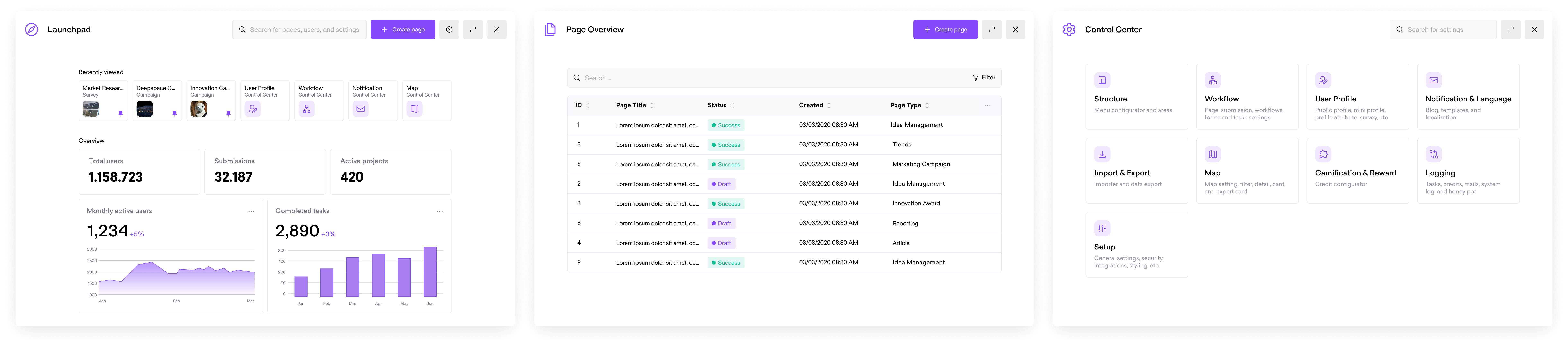
01. Irrelevant Dashboard Info

Users considered the dashboard statistics and KPIs largely irrelevant to their needs. Most users rarely interacted with the dashboard directly, instead relying on the “recently visited” section as their primary way to access pages.

02. Insufficient Recently Visited

Recently visited items were not always enough. Instead of relying on search or the dashboard, users preferred direct access methods like typing URLs or using page-specific shortcuts to quickly reach their destination.

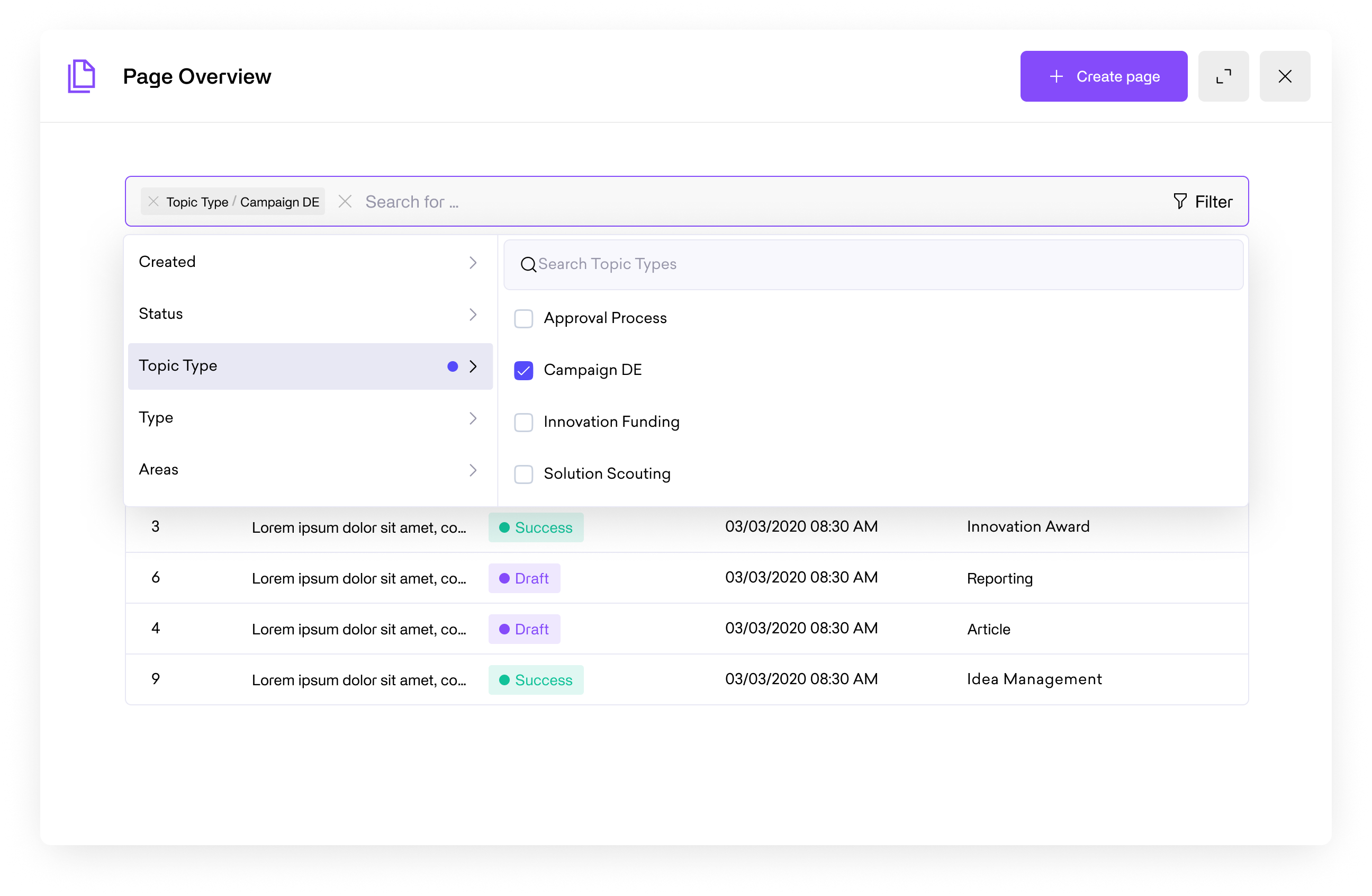
03. Navigation Overload and Inconsistencies

Users felt overwhelmed by too many topics and confused by inconsistent naming. Duplicate labels and multiple access paths to the same page added to the navigation inefficiency.

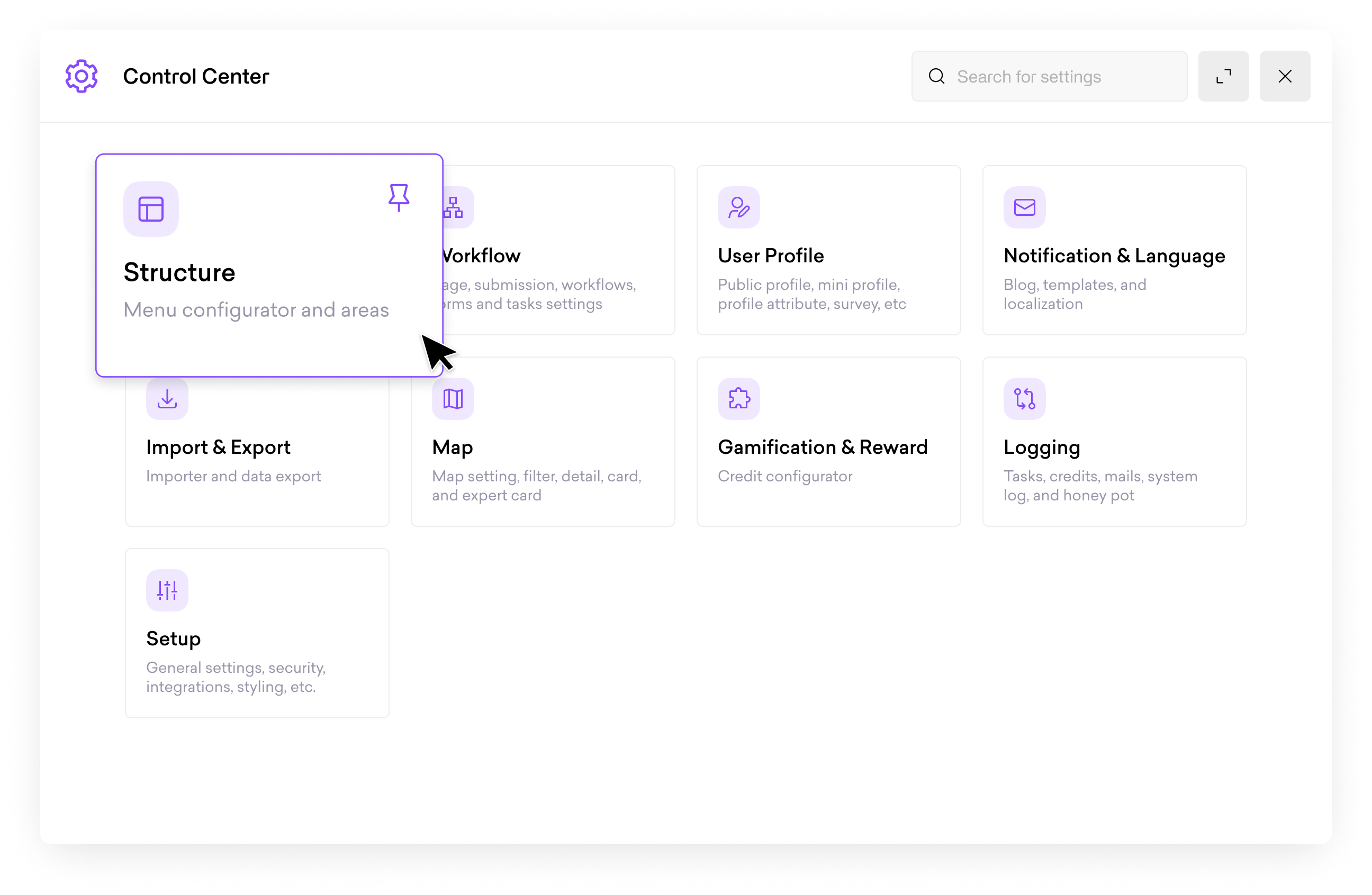
04. Complex and Fragmented Setup

Setting up workflows was described as the most challenging task, since related settings were scattered across multiple tabs and often inconsistent. Without a centralized place for workflow configuration, users spent unnecessary time navigating back and forth to complete tasks.

05. Lack of Customization

Users desire a customizable dashboards, such as pinning topics or settings. They also highlighted the need for templates tailored to specific use cases. In addition, admins and campaign owners wanted more specialized overviews and analytics to support their roles.

06. Limited Bookmark Utility

Users suggested that pinning items in “Recently Visited” or creating bookmarks for frequently accessed pages could make navigation more practical and efficient.

How might we redesign and unify the navigation to help users efficiently find, access, and manage the features and information they need?

Solution

We decided to redesign key parts of the platform to streamline workflows, reduce clutter, and make information easier to find for enterprise users.

Final Design

Customizable Dashboard

Painpoint

The dashboard doesn’t show what I need, and I can’t tailor it to my workflow.

Solution

Users can now fully customize the dashboard with different widgets, allowing them to pin relevant topics, workflow settings, or analytics. This ensures the dashboard aligns with individual needs and priorities, improving efficiency and usability.

Page Overview with Enhanced Filter & Search

Painpoint

I struggle to find the pages or information I need quickly using the current navigation or dashboard.

Solution

A new page overview was designed with advanced filtering and search, helping users locate the right pages and data efficiently. The improved layout and search functionality reduces time spent navigating and supports better decision-making.

Redesigned Settings Modal

Painpoint

Settings are scattered and confusing, and I often don’t know what’s inside each group or where I am in the system.

Solution

The new settings modal groups related settings with clear descriptions, and adds breadcrumbs for deeper layers. Users can now understand what each group contains and easily find their way through the configuration system, improving task completion and reducing errors.

Unified User Content Page

Painpoint

I have to switch between different pages to see submissions and survey responses, which is time-consuming and confusing.

Solution

We combined the submission overview and survey responses into a single user content modal and updated it with a new data table. This allows users to view all relevant information in one place, improving efficiency and reducing context switching.

Takeaways

01. Learning prompt engineering by doing

Since prompt engineering was new to me, I took the initiative to learn it hands-on, experimenting in LangSmith to design and test prompts. This experience taught me how to translate design intentions into effective AI behaviors, expanding my skill set beyond UX design.

02. Turning user insights into design decisions

I learned the importance of grounding design in research before ideating, taking the time to gather and analyze user feedback before creating solutions. By validating assumptions and iterating on prototypes based on real user input, I ensured the final design truly addressed user needs and avoided solving problems that didn’t exist.

03. Iterating quickly to refine solutions

Through multiple rounds of prototyping and iteration, I learned the value of testing ideas early and often. Each cycle of feedback and refinement helped improve usability, clarify AI interactions, and ensure the final solution was both intuitive and effective for users.

04. Navigating cross-functional collaboration

Working closely with developers pushed me to adapt my communication—from visualizing ideas for non-designers to clarifying technical needs during implementation.